The Near Future of CSS
182 likes•109,807 views

This document summarizes upcoming CSS features like Box Alignment Level 3, CSS Grid Layout, CSS Shapes, CSS Feature Queries, and CSS Custom Properties. It explains what each feature does at a high level and provides example code snippets. The document also encourages developers to get involved by filing issues on browser bug trackers, requesting new features, and creating blog posts/demos to help drive adoption of these new CSS specifications.


The Near Future of CSS
- 1. The Near Future of CSS Rachel Andrew
- 2. Rachel Andrew » https://rachelandrew.co.uk » https://grabaperch.com » @rachelandrew » Invited Expert to the CSS Working Group » Google Developer Expert
- 3. Box Alignment Level 3 This is the vertical centering module!
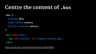
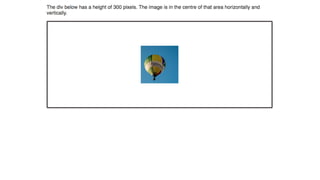
- 4. Centre the content of .box .box { display: flex; align-items: center; justify-content: center; } <div class="box"> <img alt="balloon" src="square-balloon.jpg"> </div> http://codepen.io/rachelandrew/pen/XKaZWm
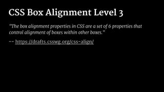
- 6. CSS Box Alignment Level 3 "The box alignment properties in CSS are a set of 6 properties that control alignment of boxes within other boxes." -- https://drafts.csswg.org/css-align/
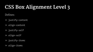
- 7. CSS Box Alignment Level 3 Defines: » justify-content » align-content » justify-self » align-self » justify-items » align-items
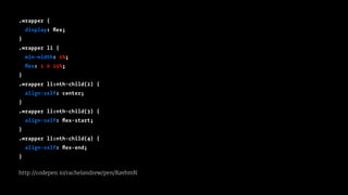
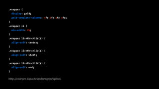
- 9. .wrapper { display: flex; } .wrapper li { min-width: 1%; flex: 1 0 25%; } .wrapper li:nth-child(2) { align-self: center; } .wrapper li:nth-child(3) { align-self: flex-start; } .wrapper li:nth-child(4) { align-self: flex-end; } http://codepen.io/rachelandrew/pen/RavbmN
- 10. The Box Alignment spec defines how these properties work in other layout methods
- 11. .wrapper { display: grid; grid-template-columns: 1fr 1fr 1fr 1fr; } .wrapper li { min-width: 1%; } .wrapper li:nth-child(2) { align-self: center; } .wrapper li:nth-child(3) { align-self: start; } .wrapper li:nth-child(4) { align-self: end; } http://codepen.io/rachelandrew/pen/jqdNoL
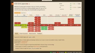
- 12. CSS Grid Layout "Unlike Flexbox, however, which is single-axis–oriented, Grid Layout is optimized for 2-dimensional layouts: those in which alignment of content is desired in both dimensions." -- https://drafts.csswg.org/css-grid/
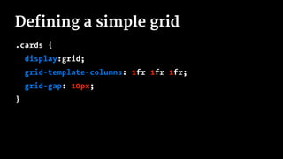
- 13. Defining a simple grid .cards { display:grid; grid-template-columns: 1fr 1fr 1fr; grid-gap: 10px; }
- 14. The fr unit Defines a fraction unit - a fraction of the available space. Works in a similar way to using flex-grow with a positive value.
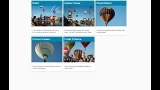
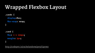
- 16. Wrapped Flexbox Layout .cards { display:flex; flex-wrap: wrap; } .card { flex: 1 1 250px; margin: 5px; } http://codepen.io/rachelandrew/pen/Gqvrwz
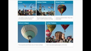
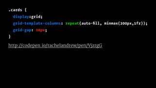
- 18. .cards { display:grid; grid-template-columns: repeat(auto-fill, minmax(200px,1fr)); grid-gap: 10px; } http://codepen.io/rachelandrew/pen/VjzrgG
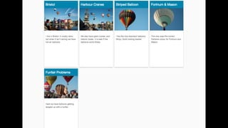
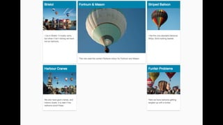
- 20. .cards { display:grid; grid-template-columns: repeat(12,1fr); grid-gap: 10px; } .card:nth-child(1) { grid-column: 1 / 4; } .card:nth-child(2) { grid-column: 1 / 4; grid-row: 2; } .card:nth-child(3) { grid-column: 9 / 13; grid-row: 2; } .card:nth-child(4) { grid-column: 4 / 10; } .card:nth-child(5) { grid-column: 10 / 13; } http://codepen.io/rachelandrew/pen/XKaZwa
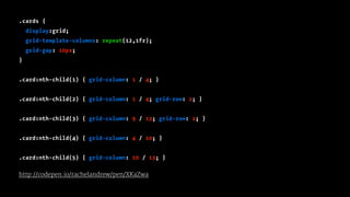
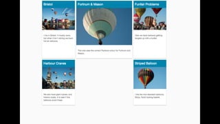
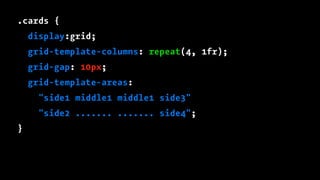
- 22. .card:nth-child(1) { grid-area: side1; } .card:nth-child(2) { grid-area: side2; } .card:nth-child(3) { grid-area: side3; } .card:nth-child(4) { grid-area: middle1; } .card:nth-child(5) { grid-area: side4; }
- 23. .cards { display:grid; grid-template-columns: repeat(4, 1fr); grid-gap: 10px; grid-template-areas: "side1 middle1 middle1 side3" "side2 ....... ....... side4"; }
- 26. Lots of Grid Examples http://gridbyexample.com
- 27. CSS Shapes "CSS Shapes describe geometric shapes for use in CSS. For Level 1, CSS Shapes can be applied to floats. A circle shape on a float will cause inline content to wrap around the circle shape instead of the float’s bounding box." -- https://drafts.csswg.org/css-shapes/
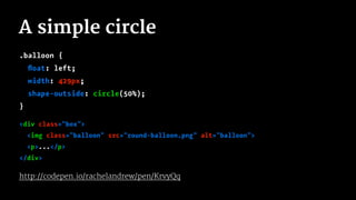
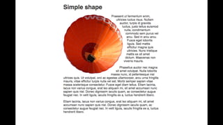
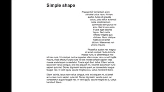
- 29. A simple circle .balloon { float: left; width: 429px; shape-outside: circle(50%); } <div class="box"> <img class="balloon" src="round-balloon.png" alt="balloon"> <p>...</p> </div> http://codepen.io/rachelandrew/pen/KrvyQq
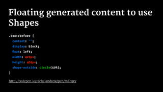
- 31. Floating generated content to use Shapes .box::before { content: ""; display: block; float: left; width: 429px; height: 409px; shape-outside: circle(50%); } http://codepen.io/rachelandrew/pen/mErqxy
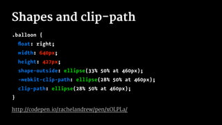
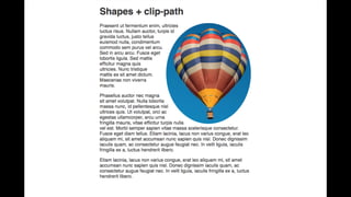
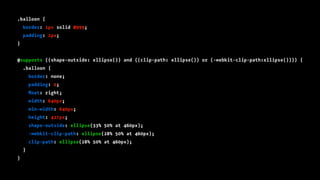
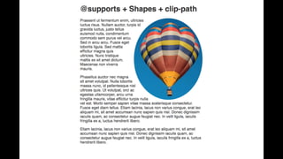
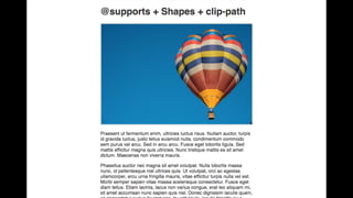
- 33. Shapes and clip-path .balloon { float: right; width: 640px; height: 427px; shape-outside: ellipse(33% 50% at 460px); -webkit-clip-path: ellipse(28% 50% at 460px); clip-path: ellipse(28% 50% at 460px); } http://codepen.io/rachelandrew/pen/xOLPLa/
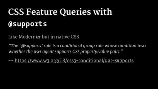
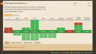
- 35. CSS Feature Queries with @supports Like Modernizr but in native CSS. "The ‘@supports’ rule is a conditional group rule whose condition tests whether the user agent supports CSS property:value pairs." -- https://www.w3.org/TR/css3-conditional/#at-supports
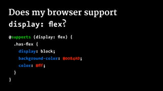
- 37. Does my browser support display: flex? @supports (display: flex) { .has-flex { display: block; background-color: #0084AD; color: #fff; } }
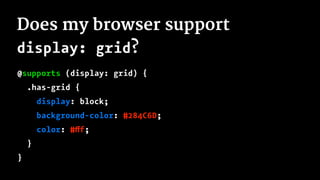
- 38. Does my browser support display: grid? @supports (display: grid) { .has-grid { display: block; background-color: #284C6D; color: #fff; } }
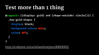
- 39. Test more than 1 thing @supports ((display: grid) and (shape-outside: circle())) { .has-grid-shapes { display: block; background-color: #666; color: #fff; } } http://codepen.io/rachelandrew/pen/RRkWKX/
- 40. .balloon { border: 1px solid #999; padding: 2px; } @supports ((shape-outside: ellipse()) and ((clip-path: ellipse()) or (-webkit-clip-path:ellipse()))) { .balloon { border: none; padding: 0; float: right; width: 640px; min-width: 640px; height: 427px; shape-outside: ellipse(33% 50% at 460px); -webkit-clip-path: ellipse(28% 50% at 460px); clip-path: ellipse(28% 50% at 460px); } }
- 43. Using feature queries » Write the css for older browsers » Inside the feature query reset those properties » Inside the feature query write your new CSS http://codepen.io/rachelandrew/pen/vKJmXR
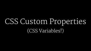
- 44. CSS Custom Properties (CSS Variables!)
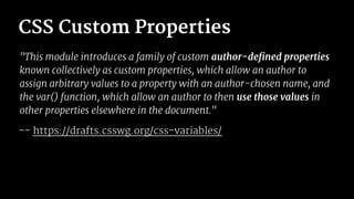
- 45. CSS Custom Properties "This module introduces a family of custom author-defined properties known collectively as custom properties, which allow an author to assign arbitrary values to a property with an author-chosen name, and the var() function, which allow an author to then use those values in other properties elsewhere in the document." -- https://drafts.csswg.org/css-variables/
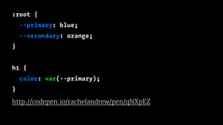
- 46. :root { --primary: blue; --secondary: orange; } h1 { color: var(--primary); } http://codepen.io/rachelandrew/pen/qNXpEZ
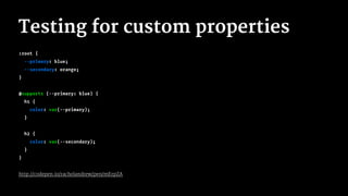
- 47. Testing for custom properties :root { --primary: blue; --secondary: orange; } @supports (--primary: blue) { h1 { color: var(--primary); } h2 { color: var(--secondary); } } http://codepen.io/rachelandrew/pen/mErpZA
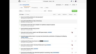
- 49. Getting Involved CSS Specification discussion and issues are on github https://github.com/w3c/csswg-drafts
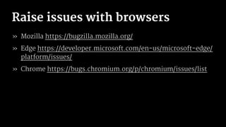
- 51. Raise issues with browsers » Mozilla https://bugzilla.mozilla.org/ » Edge https://developer.microsoft.com/en-us/microsoft-edge/ platform/issues/ » Chrome https://bugs.chromium.org/p/chromium/issues/list
- 52. Request features Directly request features where browsers give you the means to do so. Writing blog posts, presentations and demos also helps.
- 53. If we don’t ask we don’t get Make some noise for the new shiny!