Flexbox, Grid and Sass
0 likes•137 views

The document discusses advanced CSS3 topics including custom CSS properties, responsive page layouts using Flexboxes, Grids, and media queries. It covers defining CSS variables, using the var() function, inheritance of custom properties. Flexbox concepts like flex containers, items, properties like flex-direction, justify-content are explained. CSS Grid layout system including grid-template-columns/rows properties and grid line placement is covered. Media queries allow defining styles for different viewports using expressions. CSS preprocessors like Sass are also summarized, covering features such as variables, nesting, imports, mixins and extends to reduce repetition in CSS.
Flexbox, Grid and Sass
- 1. Advanced CSS3 Compiled by: Seble Nigussie
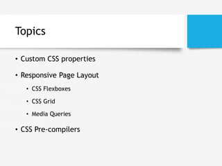
- 2. Topics • Custom CSS properties • Responsive Page Layout • CSS Flexboxes • CSS Grid • Media Queries • CSS Pre-compilers
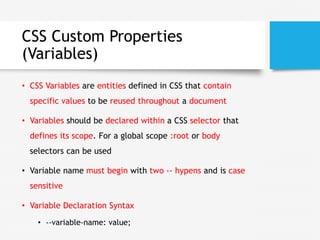
- 3. CSS Custom Properties (Variables) • CSS Variables are entities defined in CSS that contain specific values to be reused throughout a document • Variables should be declared within a CSS selector that defines its scope. For a global scope :root or body selectors can be used • Variable name must begin with two -- hypens and is case sensitive • Variable Declaration Syntax • --variable-name: value;
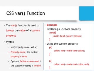
- 4. CSS var() Function • The var() function is used to lookup the value of a custom property • Syntax • var(property-name, value) • Property-name: the custom property’s name • Optional fallback value used if the custom property is invalid • Example • Declaring a custom property :root{ --main-text-color: brown; } • Using the custom property p{ color: var(--main-text-color); } a{ color: var(--main-text-color, red); }
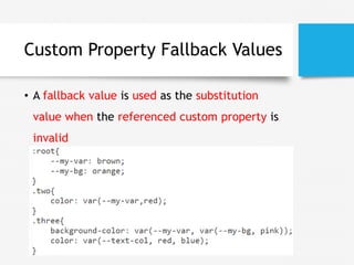
- 5. Custom Property Fallback Values • A fallback value is used as the substitution value when the referenced custom property is invalid
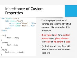
- 6. Inheritance of Custom Properties • Custom property values of parents’ are inherited by child elements like most other CSS properties • If no value is set for a custom property on a given element, the value of its parent is used • Eg. font-size of class four will inherit the --test definition of class two
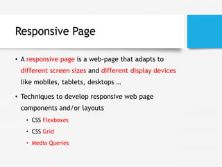
- 7. Responsive Page • A responsive page is a web-page that adapts to different screen sizes and different display devices like mobiles, tablets, desktops … • Techniques to develop responsive web page components and/or layouts • CSS Flexboxes • CSS Grid • Media Queries
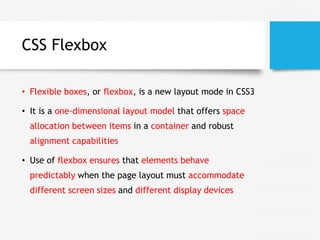
- 8. CSS Flexbox • Flexible boxes, or flexbox, is a new layout mode in CSS3 • It is a one-dimensional layout model that offers space allocation between items in a container and robust alignment capabilities • Use of flexbox ensures that elements behave predictably when the page layout must accommodate different screen sizes and different display devices
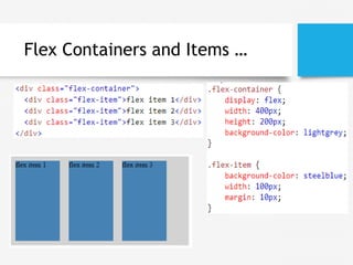
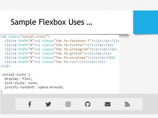
- 9. Flex Containers and Items • Flexbox consists of flex containers and flex items • Flexbox defines how flex items are laid out inside a flex container • A flex container expands its items to fill available free space or shrinks them to prevent overflow • A flex container is declared by setting the display property of an element to either flex (rendered as a block) or inline- flex (rendered as inline element)
- 10. Flex Containers and Items …
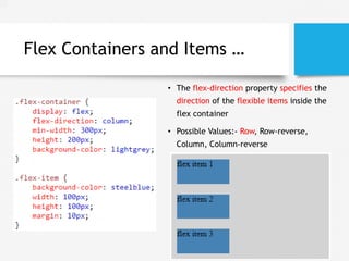
- 11. Flex Containers and Items … • The flex-direction property specifies the direction of the flexible items inside the flex container • Possible Values:- Row, Row-reverse, Column, Column-reverse
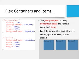
- 12. Flex Containers and Items … • The justify-content property horizontally aligns the flexible container's items • Possible Values: flex-start, flex-end, center, space-between, space- around
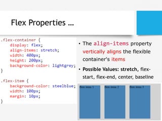
- 13. Flex Properties … • The align-items property vertically aligns the flexible container's items • Possible Values: stretch, flex- start, flex-end, center, baseline
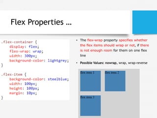
- 14. Flex Properties … • The flex-wrap property specifies whether the flex items should wrap or not, if there is not enough room for them on one flex line • Possible Values: nowrap, wrap, wrap-reverse
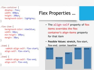
- 15. Flex Properties … • The align-self property of flex items overrides the flex container's align-items property for that item • Possible Values: stretch, flex-start, flex-end, center, baseline
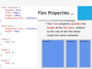
- 16. Flex Properties … • The flex property specifies the length of the flex item, relative to the rest of the flex items inside the same container
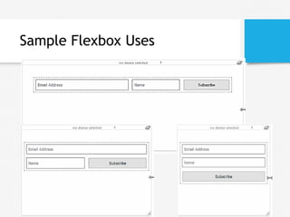
- 17. Sample Flexbox Uses …
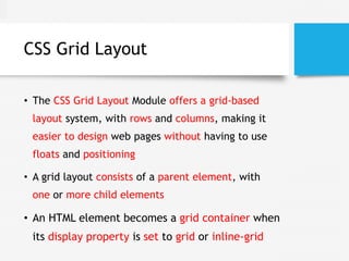
- 19. CSS Grid Layout • The CSS Grid Layout Module offers a grid-based layout system, with rows and columns, making it easier to design web pages without having to use floats and positioning • A grid layout consists of a parent element, with one or more child elements • An HTML element becomes a grid container when its display property is set to grid or inline-grid
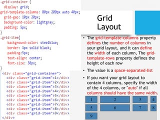
- 20. Grid Layout • The grid-template-columns property defines the number of columns in your grid layout, and it can define the width of each column, The grid- template-rows property defines the height of each row • The value is a space-separated-list • If you want your grid layout to contain 4 columns, specify the width of the 4 columns, or "auto" if all columns should have the same width.
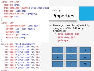
- 21. Grid Properties • Items gaps can be adjusted by using one of the following properties: • grid-column-gap grid-row-gap grid-gap
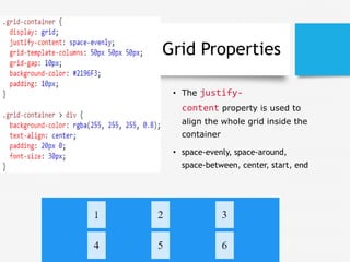
- 22. Grid Properties • The justify- content property is used to align the whole grid inside the container • space-evenly, space-around, space-between, center, start, end
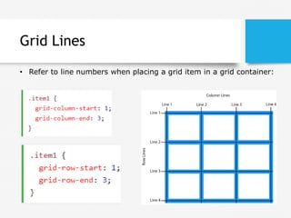
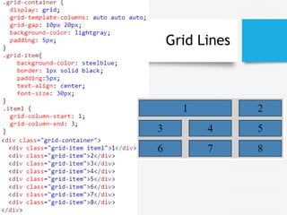
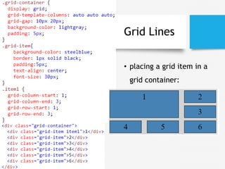
- 23. Grid Lines • Refer to line numbers when placing a grid item in a grid container:
- 24. Grid Lines
- 25. Grid Lines • placing a grid item in a grid container:
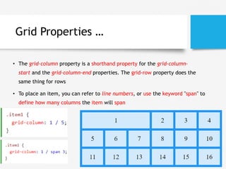
- 26. Grid Properties … • The grid-column property is a shorthand property for the grid-column- start and the grid-column-end properties. The grid-row property does the same thing for rows • To place an item, you can refer to line numbers, or use the keyword "span" to define how many columns the item will span
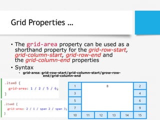
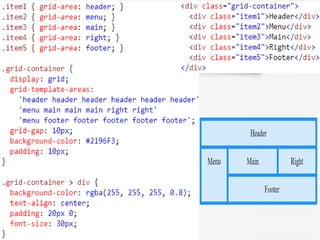
- 27. Grid Properties … • The grid-area property can be used as a shorthand property for the grid-row-start, grid-column-start, grid-row-end and the grid-column-end properties • Syntax • grid-area: grid-row-start/grid-column-start/grow-row- end/grid-column-end
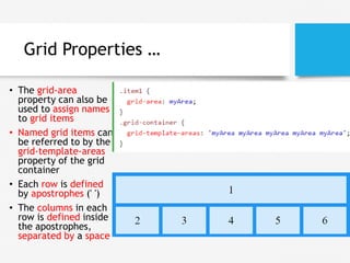
- 28. Grid Properties … • The grid-area property can also be used to assign names to grid items • Named grid items can be referred to by the grid-template-areas property of the grid container • Each row is defined by apostrophes (' ') • The columns in each row is defined inside the apostrophes, separated by a space
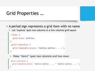
- 29. Grid Properties … • A period sign represents a grid item with no name • Make "item1" span two columns and two rows: • Let "myArea" span two columns in a five columns grid layout
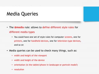
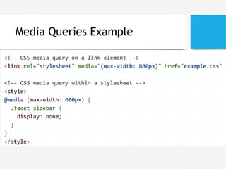
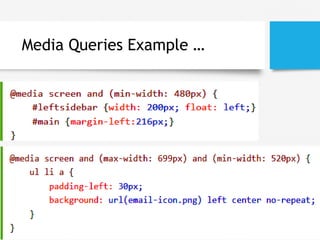
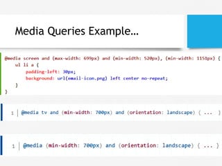
- 31. Media Queries • The @media rule: allows to define different style rules for different media types • You could have one set of style rules for computer screens, one for printers, one for handheld devices, one for television-type devices, and so on • Media queries can be used to check many things, such as: • width and height of the viewport • width and height of the device • orientation (is the tablet/phone in landscape or portrait mode?) • resolution
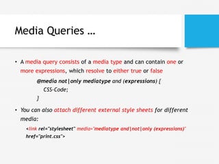
- 32. Media Queries … • A media query consists of a media type and can contain one or more expressions, which resolve to either true or false @media not|only mediatype and (expressions) { CSS-Code; } • You can also attach different external style sheets for different media: <link rel="stylesheet" media="mediatype and|not|only (expressions)" href="print.css">
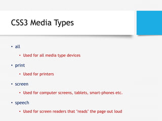
- 33. CSS3 Media Types • all • Used for all media type devices • print • Used for printers • screen • Used for computer screens, tablets, smart-phones etc. • speech • Used for screen readers that "reads" the page out loud
- 35. Media Queries Example …
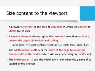
- 37. Size content to the viewport • A Browser’s viewport is the area of web page in which the content is visible to the user • A <meta> viewport element gives the browser instructions on how to control the page's dimensions and scaling <meta name="viewport" content="width=device-width, initial-scale=1.0"> • The width=device-width sets the width of the page to follow the screen-width of the device (which will vary depending on the device) • The initial-scale=1.0 sets the initial zoom level when the page is first loaded by the browser
- 38. Exercises • Calculator with flexbox or grid
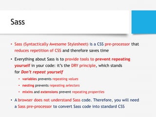
- 39. Sass • Sass (Syntactically Awesome Stylesheet) is a CSS pre-processor that reduces repetition of CSS and therefore saves time • Everything about Sass is to provide tools to prevent repeating yourself in your code: it’s the DRY principle, which stands for Don’t repeat yourself • variables prevents repeating values • nesting prevents repeating selectors • mixins and extensions prevent repeating properties • A browser does not understand Sass code. Therefore, you will need a Sass pre-processor to convert Sass code into standard CSS
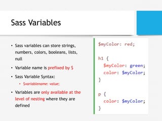
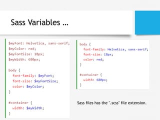
- 40. Sass Variables • Sass variables can store strings, numbers, colors, booleans, lists, null • Variable name is prefixed by $ • Sass Variable Syntax: • $variablename: value; • Variables are only available at the level of nesting where they are defined
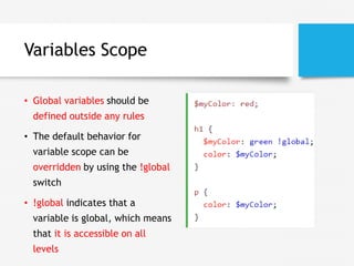
- 41. Variables Scope • Global variables should be defined outside any rules • The default behavior for variable scope can be overridden by using the !global switch • !global indicates that a variable is global, which means that it is accessible on all levels
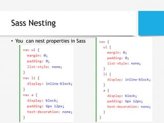
- 42. Sass Nesting • You can nest properties in Sass
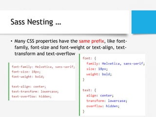
- 43. Sass Nesting … • Many CSS properties have the same prefix, like font- family, font-size and font-weight or text-align, text- transform and text-overflow
- 44. Sass @import • You can create small files with CSS snippets to include in other Sass files. Examples of such files can be: reset file, variables, colors, fonts etc • The @import directive allows you to include the content of one file in another • Sass Import Syntax: • @import filename; • @import "variables"; • You do not need to specify a file extension, Sass automatically assumes that you mean a .sass or .scss
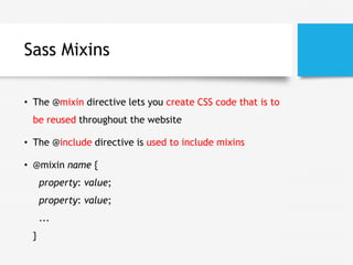
- 45. Sass Mixins • The @mixin directive lets you create CSS code that is to be reused throughout the website • The @include directive is used to include mixins • @mixin name { property: value; property: value; ... }
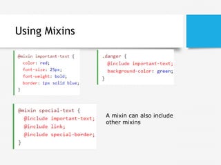
- 46. Using Mixins A mixin can also include other mixins
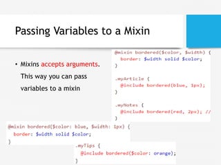
- 47. Passing Variables to a Mixin • Mixins accepts arguments. This way you can pass variables to a mixin
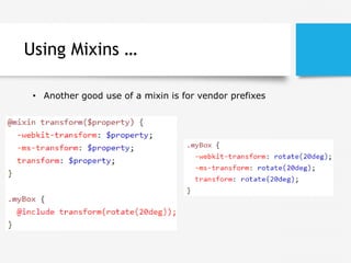
- 48. Using Mixins … • Another good use of a mixin is for vendor prefixes
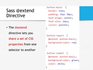
- 49. Sass @extend Directive • The @extend directive lets you share a set of CSS properties from one selector to another
- 50. Sass Variables … Sass files has the ".scss" file extension.