

Fostering Historical Inquiry in the Middle Years Classroom
- 1. Fostering Historical Inquiry in the Middle Years History Classroom Dr Catherine Hart Luther College, Croydon
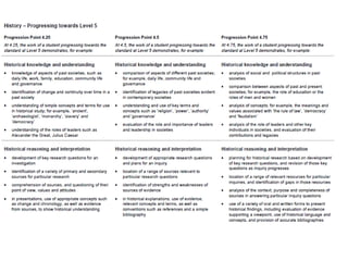
- 2. Learning in the middle years needs to be RELEVANT
- 3. • Relevant to policy & curriculum • Relevant to learners (VELS - Unit of work – sequence of lessons)
- 4. Learning in the middle years needs to be PURPOSEFUL
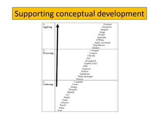
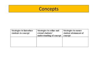
- 7. Concepts
- 9. Learning in the middle years needs to be CLEAR and EXPLICIT
- 11. Learning in the middle years needs to be MANAGEABLE
- 13. Learning in the middle years needs to be LEARNER CENTRED
- 14. How do learning tasks ENGAGE learners? What is your ‘hook’? How do learning tasks cater for different STUDENT ABILITIES and LEARNING STYLES?
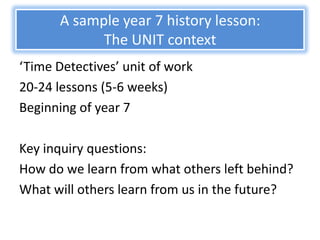
- 17. A sample year 7 history lesson: The UNIT context ‘Time Detectives’ unit of work 20-24 lessons (5-6 weeks) Beginning of year 7 Key inquiry questions: How do we learn from what others left behind? What will others learn from us in the future?
- 18. The VELS context
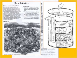
- 20. Before SAMPLE lesson: 1. How do we investigate the past? Why is it important? 2. What is archaeology? What is it not? 3. Why is archaeology important? What do archaeologists do? 4. The archaeological process - why do it and how is it done? (LESSON FITS IN HERE)
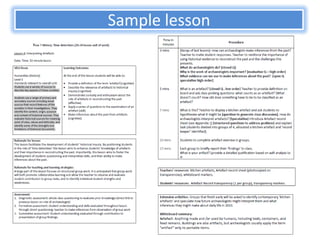
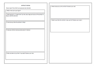
- 21. Sample lesson
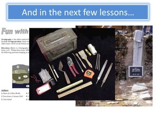
- 24. And in the next few lessons…
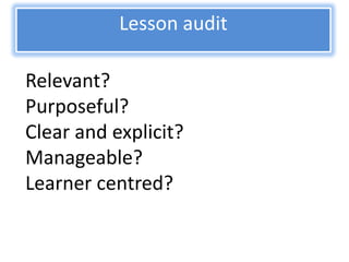
- 28. Lesson audit Relevant? Purposeful? Clear and explicit? Manageable? Learner centred?
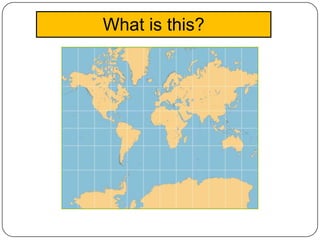
- 29. What is this?
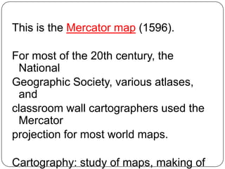
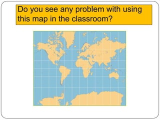
- 30. This is the Mercator map (1596). For most of the 20th century, the National Geographic Society, various atlases, and classroom wall cartographers used the Mercator projection for most world maps. Cartography: study of maps, making of
- 31. Do you see any problem with using this map in the classroom?
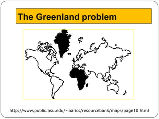
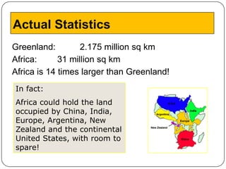
- 33. Actual Statistics Greenland: 2.175 million sq km Africa: 31 million sq km Africa is 14 times larger than Greenland! In fact: Africa could hold the land occupied by China, India, Europe, Argentina, New Zealand and the continental United States, with room to spare!
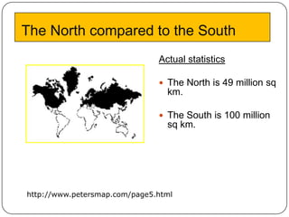
- 34. The North compared to the South Actual statistics The North is 49 million sq km. The South is 100 million sq km. http://www.petersmap.com/page5.html
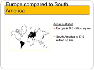
- 35. Europe compared to South America Actual statistics Europe is 9.8 million sq km. South America is 17.9 million sq km.
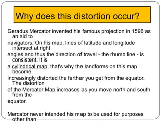
- 36. Why does this distortion occur? Geradus Mercator invented his famous projection in 1596 as an aid to navigators. On his map, lines of latitude and longitude intersect at right angles and thus the direction of travel - the rhumb line - is consistent. It is a cylindrical map, that's why the landforms on this map become increasingly distorted the farther you get from the equator. The distortion of the Mercator Map increases as you move north and south from the equator. Mercator never intended his map to be used for purposes
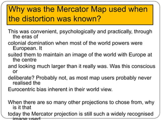
- 37. Why was the Mercator Map used when the distortion was known? This was convenient, psychologically and practically, through the eras of colonial domination when most of the world powers were European. It suited them to maintain an image of the world with Europe at the centre and looking much larger than it really was. Was this conscious or deliberate? Probably not, as most map users probably never realised the Eurocentric bias inherent in their world view. When there are so many other projections to chose from, why is it that today the Mercator projection is still such a widely recognised
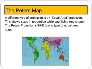
- 38. The Peters Map A different type of projection is an ‘Equal-Area’ projection. This shows sizes in proportion while sacrificing true shape. The Peters Projection (1974) is one type of equal area map.
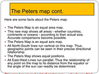
- 39. The Peters map cont. Here are some facts about the Peters map: The Peters Map is an equal area map. This new map shows all areas - whether countries, continents or oceans - according to their actual size. Accurate comparisons become possible. The Peters Map is an equal axis map. All North-South lines run vertical on this map. Thus, geographic points can be seen in their precise directional relationship. The Peters Map shows equal positions. All East-West Lines run parallel. Thus the relationship of any point on the map to its distance from the equator or the angle of the sun can readily be determined.
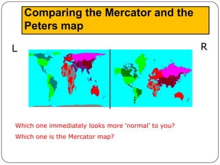
- 40. Comparing the Mercator and the Peters map L R Which one immediately looks more ‘normal’ to you? Which one is the Mercator map?